Imagine Worlds: Dave Phillips Illustration
- Chloe King

- Apr 18, 2019
- 5 min read
Updated: Jun 5, 2019
The final part for this section in the Imagine Worlds category was to copy the artists style we had previously chosen to write about. We could go about this in two different ways, either find an artwork from the artist and choose a section to copy or make our own artwork but use the style of the artist.
I knew from the start I would pick an artwork to replicate as that is something I have done before and I knew I would enjoy it more. Although I did end up procrastinating a lot with this task before I even opened up Krita but once I did start I ended up enjoying it.
The artwork I chose to copy is "The Cloudbreather's Crag" which is one of the concept artworks Phillips did for Skylanders: SuperChargers.

I honestly chose this image due to the giant dragon that immediately captures your attention and the use of colours with the sunset that looks like its apart of the dragons skin. I also wanted to pick a piece I knew I could realistically do but still be challenging. Which this image did prove to be, my own style is more neat and inside the lines whereas Phillips is messy and you can see the different layers and brush strokes from where he's not blended it correctly, so this artwork was going against everything I stood for and I am really happy with how it turned out.

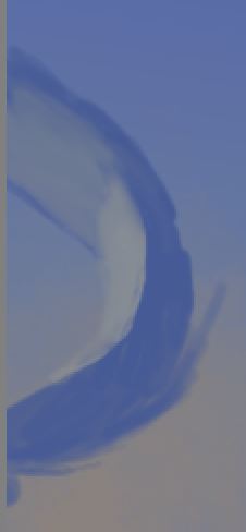
First things first, the line art. I picked the right side of the artwork so I could get the dragon in there and also because looking at the little hut Phillips had painted confused me. I told myself I wouldn't have it so the image was underneath so I could just copy everything exactly but I did have to at some points just to make sure some parts were in the correct area. I did do this for the line art so I could go based off of that and I did have a reference image next to my one for colour picking and obviously the reference.


I started off with the sky to get going and I used the gradient tool for this to get the lighter and darker blue tones and then using a textured brush I did the orange cloud area. The stars were just done using a normal brush and then for the outer glow I turned down the opacity on the brush and then colored the area around. The tail was easily done with a soft brush just coloring in and trying to be more messy and not overdoing the blend brush.


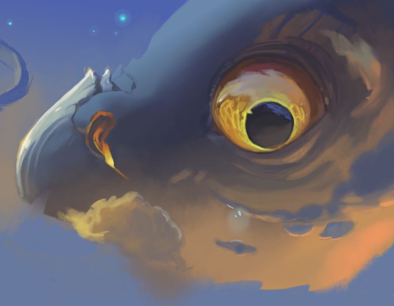


For the dragons face I once again used the gradient tool to put down the base colors. I did start on the eye first as that was the part I was most excited about. I also put down a base layer of brown and then built up the layers from there, It was hard trying to figure out the different base colors underneath the details of the bright yellow flame parts. It does seem as if one part is a burning orange and then the next is a dark brown immediately next to it so trying to get over the fact that I cant blend and slowly graduate the colors was an issue but as I developed further it got easier. Although I am happy with the eye I think the yellow around the pupil could be brighter.
I then switched between around the eye and the clouds as my plan was to move downwards with the detail and to do that the cloud had to be done first. For the area around the eye I used a soft brush to put down some color where it was meant to go and then blended it out. My only issue with the soft brush is with the pen pressure, at times I wasn't put down any color so then it wasn't as vibrant as I would like it but then if I pressed too hard it wouldn't be the soft look I going for. I used a textured brush for the edges of the clouds to give them that sparse and fluffy look and then did the same for the highlights. The glowing blue part of the clouds I used the same technique with the stars.
Moving on to the big chunk of orange, I once again used a textured brush on low opacity to gradually build up the color and fade it out into the skin. For the orange highlights around the eye I had a low opacity brush and gently added it around the eye to give it a glow. I basically used these techniques on the entire thing whilst trying to mimic his style my only issue was the brush. Phillips uses a certain brush but I cant for the life of me find what it is so I had to make do for the entire thing. Some strokes its very obvious he has used a textured brush so I did find one similar to his that used on certain areas like the bottom cloud where one corner flares out.
Some of the bigger issues I had with the face is the giant scales above the eye, although they may look fine now, when I was drawing them they were so hard to make look good. Even though they are very similar to Phillips trying to get that subtle blend on the edges of them will forever pain me.


The nose was similar where I put the base color down and built on top using a soft opacity brush and minimal blend brush to give it a soft edge. I did have to keep checking that the edges stayed within the line so the nose wouldn't be too big so I did have to go back and erase some parts.


Lastly, the ground. Surprisingly this was the most difficult part for me even though there doesn't look like much detail you'd be surprised when using the color picker tool how many shades of brown Phillips has used. This was an area I procrastinated on, it was a "so close yet so far" moment for me. Once again my usually routine of base color then build on top, I worked from right to left as that left hand corner didn't excite me at all. This was also a moment of my line art was so far off the original so I did have to put the original as a layer to work from and then hide to do my own thing. Looking back at it now It did turn out great but my personal issue was zooming in and then comparing everything to Phillips original and seeing where I've gone wrong and focusing too much on one area.

Here is my final work on copying Dave Phillips concept art (well part of it at least.) Looking at this I am so happy with the final outcome and am impressed with myself at how accurate and good it looks. Could it still be improved? yes my brush strokes don't match his exactly but I had to make do with a free art software (bless Krita) and it has helped me develop my skills as an artist to step out of my comfort zone of clean and tidy and perfectly blended.


Comments